Use the 404

TLDR: Create a custom 404
We have spent so much time fearing the 404 page that we’ve neglected what a great opportunity this can present. A well optimized website certainly limits the number of times a (potential) customer may stumble upon that dreaded 404 error. However, if someone does land on this page let’s use it to our advantage and help them navigate their way.
Wait have I lost you already? I should probably start with what a 404 page is.

What is a 404-error page?
And why should it matter to you, even if your website is practically perfect?
The simple fact is that 404s happen on every site: links go bad over time, products get removed, content gets deleted, or there may be changes in permalink structure. If a page that is needed can’t be found, the site defaults to an “error page” or “page not found” page. This is also known as a 404 page as 404 error is the standardized HTTP status code. This page indicates that the user reached the domain they requested, but the URL path provided no information.
Here’s a list of possible reasons for the 404 error:
- Mistyped URL
- Copy-and-paste error
- Broken link
- Truncated link
- Moved content.
- Deleted content.
- Broken internal link.
- Outdated search engine link
TIPS!
When relaunching a site make sure you check the redirects.
Check analytics to see why people are landing on your 404 page.
As you can see, there are many ways a web user can land on your 404-error page and not all of them have to do with something you can control. Instead of fearing this nearly unavoidable part of your website, put some thought into your 404-page by flexing your creative muscles.
Many websites contain 404 error pages that include nothing more than the actual numerical indication your web user has landed somewhere they did not intend. Others may have an “oops”, and that’s it – which, in of itself, is the biggest oopsie of all. Instead of leaving this page unbranded and your audiences unaffected by its existence (except for moderate annoyance), transform your 404-error page into something emotive, informative, or just plain awesome.

Custom 404 error pages give you another platform to showcase your personality.
When life gives you lemons, turn them into a great 404 page.
Creating a strategic website means understanding your goals and adapting each page to achieve them. From the moment your would-be-customer (new or returning), lands on your site, they are moving along your conversion funnel. With each click, they should be getting closer to making contact or making a purchase.
Not only does a 404 error not have to be the roadblock on their journey towards conversion, but a custom version of this page might make for a sweet reminder as to why you’re the brand for them. Below, we cover all the must-haves of a custom 404 error page. But don’t forget to prioritize creativity, a bold branding statement, and stand-out design as much as these technical aspects.

What to Include to Turn Lost Visitors into Loyal Customers:
- A strong headline or text explaining to a user why they are here.
It is jarring when you land on a webpage that is not what you intended. Signal to users they are on the right website but not the right page. - Power up their ability to move on quickly.
Make sure your 404-error page has the same search functionality (and in the same location) as the rest of your site. That way, users can look for the page they intended to visit. - Links to your homepage and sitemap.
If the person on the 404 didn’t already have a specific search in mind, you can give them a little nudge with design elements. Consider including a header or footer that matches the rest of the site and shows users the potential places they can go. - Strip away complex navigation.
Give that person a few meaningful next steps. Too many options here could further frustrate or confuse the user. - Include an obvious call to action.
Make it simple for them to easily get onto the right path. - Lead them in the right direction.
Consider including a few links to your most popular pages.
Combine usability with eccentric, awesome, or at the very least, thoughtful design, so your error pages pack a punch.
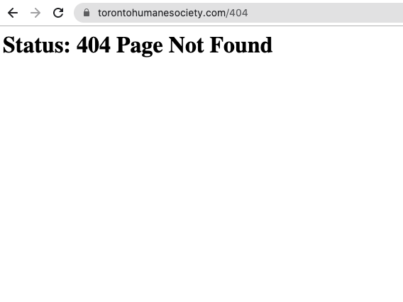
As you’ll see below, the Human Society has gone with the simple “no-go” text for their 404 page. Considering their brand is quite literally built on cute, fluffy stuff, we had the sneaking sensation this may not be their best bet for keeping users engaged. A quick search on Amazon confirmed our suspicions, as the online store mogul had used a clever play on words and imagery to transform a blah page into one that makes you wag your tail.


Design elements to avoid any errors on your 404-error page

- Make sure the page lines up with the rest of your site.
A 404 page should not stick out like a sore thumb, but rather be an extension of your brand colours and design elements. - Be bold and straightforward.
Don’t over-clutter the page; choose one or two eye-catching images to define its look and feel. - No scroll required.
There’s no need to make them search here, so say goodbye to scrolling on this page. - Admit your mistakes.
Make it clear you’re admitting your bad and make it equally clear how you can fix it. - Stay in-touch with your audience.
Inside jokes are great, except when they’re not – like on a 404 page when a new customer may just think you’re out of touch with reality.

Like a great 404 page, Foundery can help you navigate your way toward a better web experience for your clients.
Whether you’ve got a bad case of the 404s and need help optimizing your website, or you want to explore some cooler ways to leverage this page, we have all kinds of ideas that will turn what used to feel so wrong into something totally right.
Although we are looking at how to make the best possible custom 404 page it would be wrong to leave it at that. Here is just another peak into how technical SEO can help avoid people landing on a 404 page.
- Check for broken links and technical errors.
- Review your website traffic to identify where people are coming from when landing on the 404 page
The sad truth is people who reach a 404-error page are likely to leave your website and never return. Simply put, addressing 404 errors has a huge impact on your website’s overall performance. A 404 page can be your opportunity to show your brand’s personality and reengage an unhappy visitor. Use the 404 to direct your potential clients back onto the right path and help them find their way back.
Want to grow quality leads for your business? We’ve got you covered.


